Flux
I led end-to-end design for Flux, the public thesis exhibition site for Parsons' MFA Design & Technology program. I delivered a fully responsive design system on Webflow CMS, scaled across 170+ pages with developer-ready prototypes, restructured the program's information architecture for the first time, and coordinated design, branding, and development to an on-schedule launch, a two-day showcase with 200+ attendees.
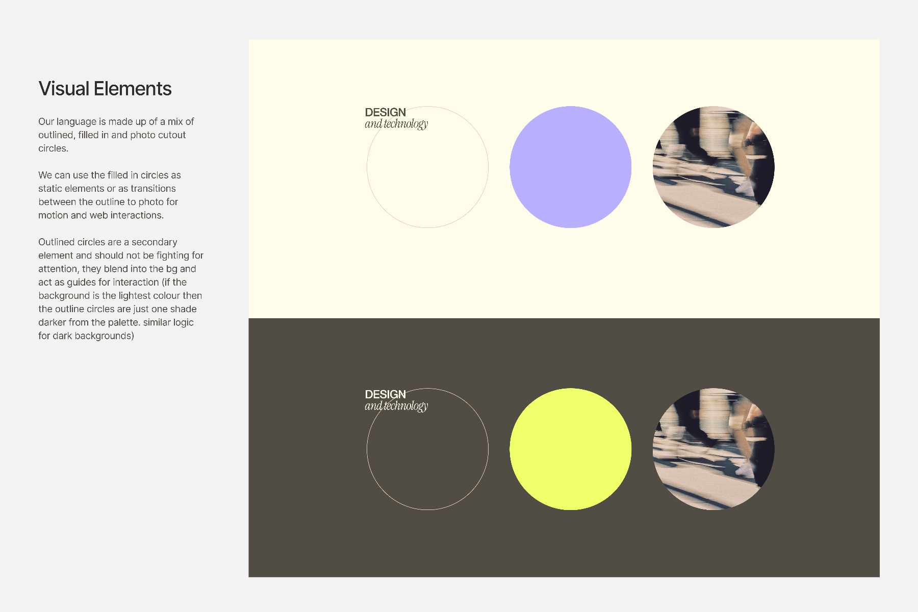
A system of circles, lemon & lilac.
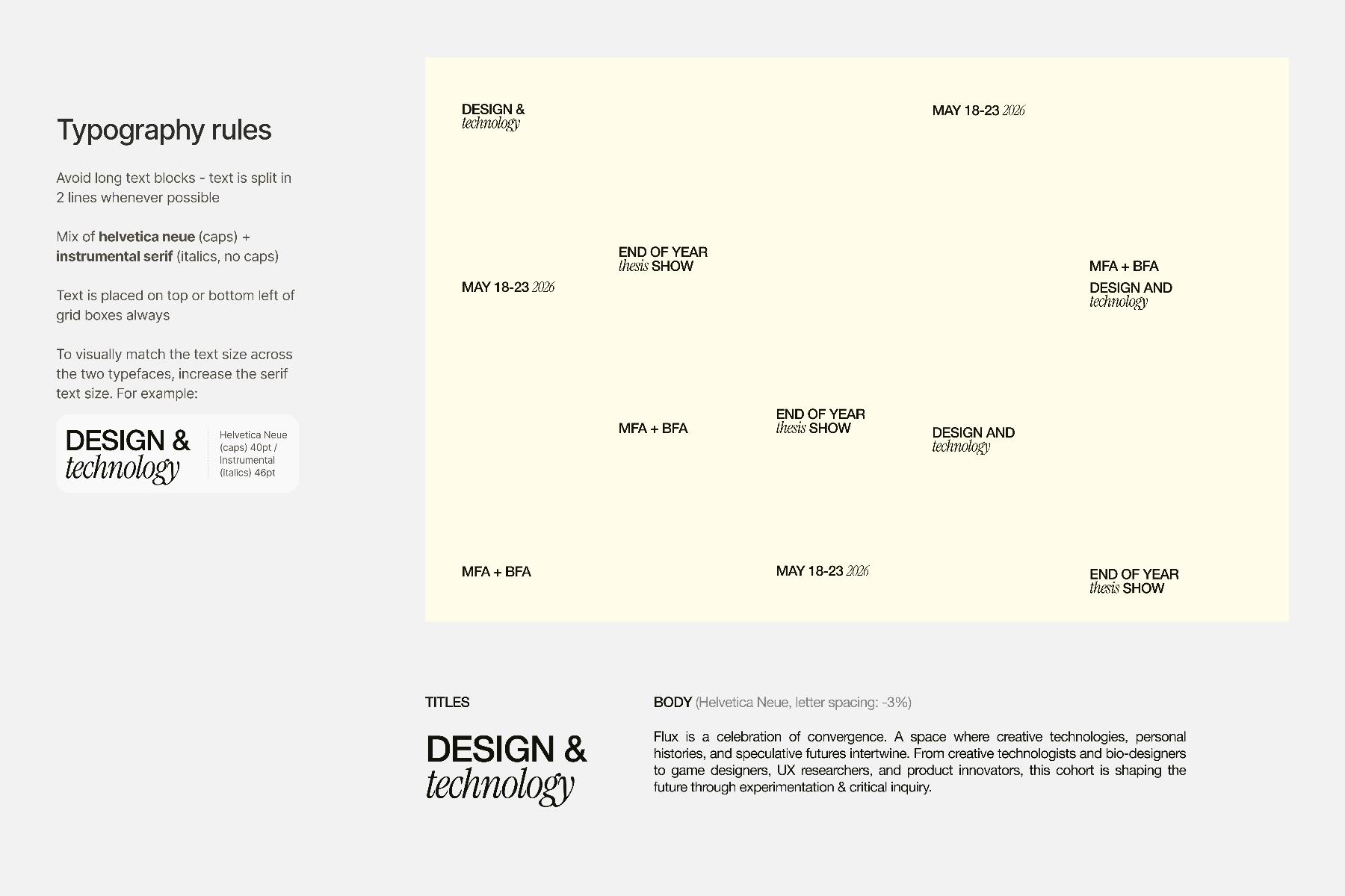
I collaborated on the brand handoff and translated it into a responsive web system. The identity runs on two primaries (lemon and lilac, never in focus together), a typographic pairing of Helvetica Neue caps with Instrumental Serif italics, and a visual language of outlined, filled, and photo-cutout circles: the dots are holes in a top layer that reveal a meaningful image of the program beneath.
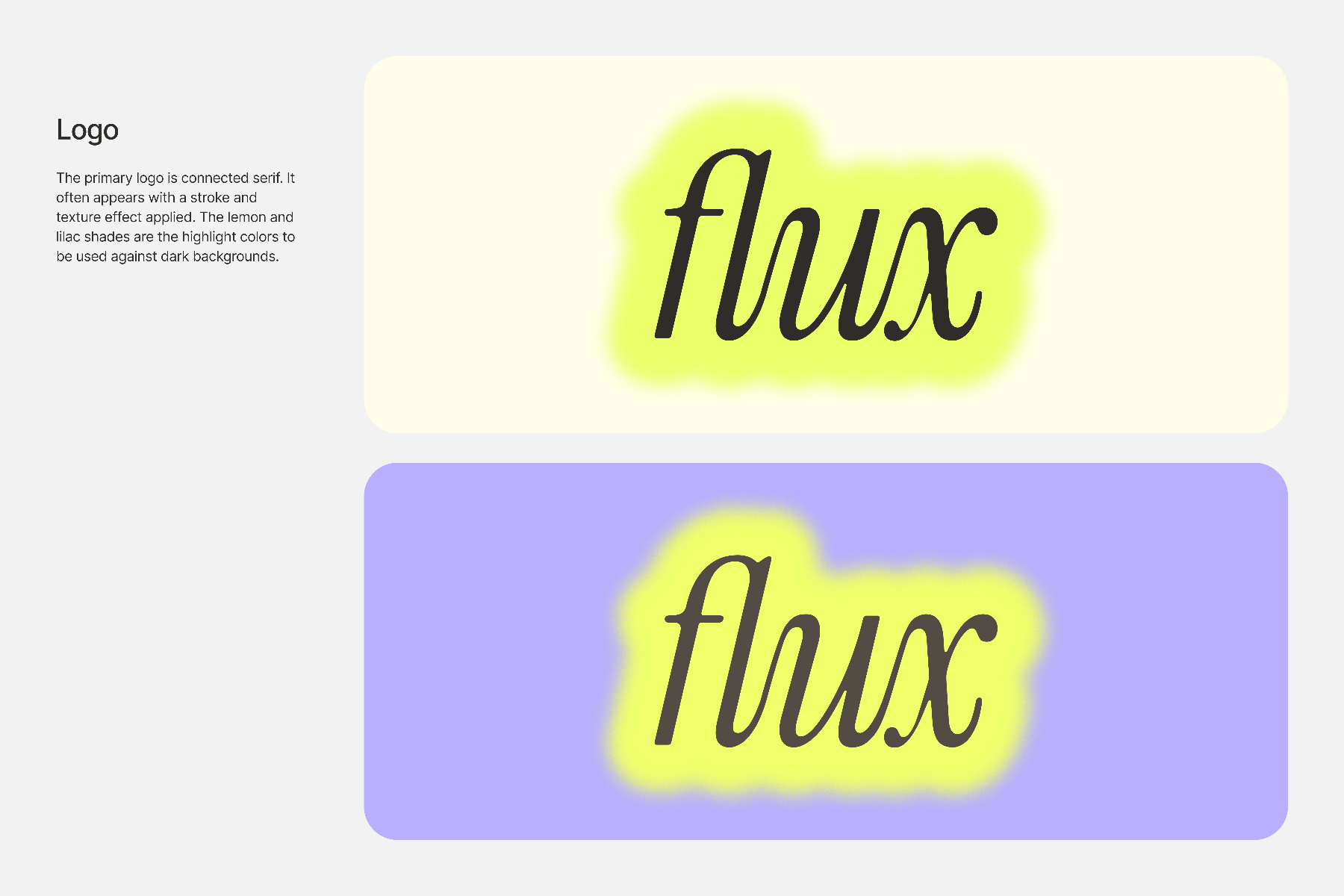
Balancing the program's funkiness with real usability.
The goal was a balance between the uniqueness of the Design and Technology program, its visual aesthetic, and usability. The program is home to many different design interests, and its students are proud of that, so we needed to be "funky" enough to honor it without branding ourselves as a communication-design-only program.
Wireframe
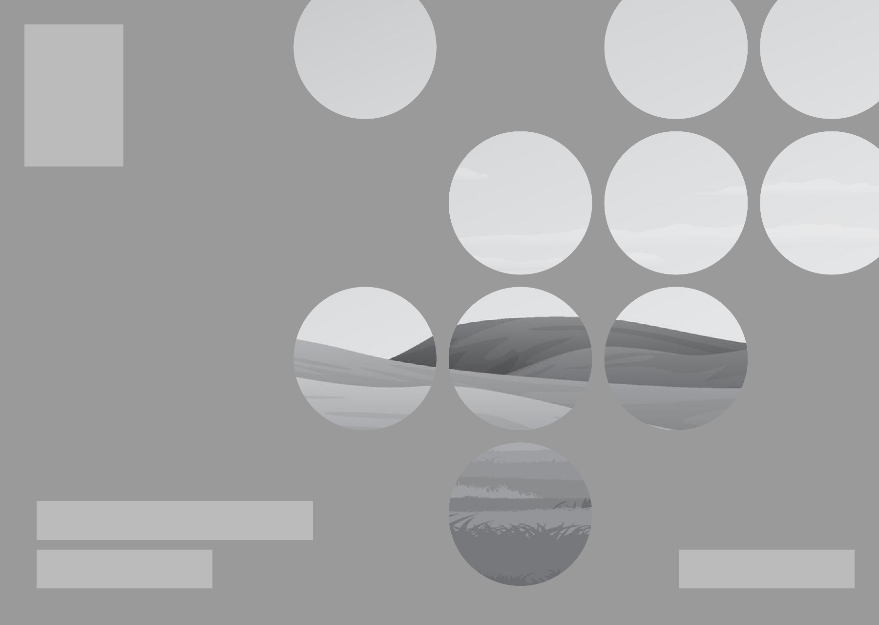
All of us experimented with ways to translate the dotted pattern to the web. We settled on this wireframe as the basis for the high-fidelity prototyping that followed, the idea being that the dots are holes on a top layer that reveal a bottom layer, ideally an image meaningful to the program.
Rapid hi-fi prototyping
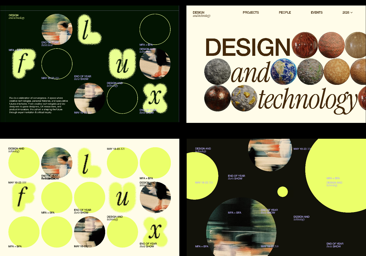
This became a prolonged but very rapid sprint through many aesthetics and presentations of the branding guidelines, figuring out quickly what resonated most with the cohort so our developer had enough runway before launch.
Option 3 & "Coming Soon"
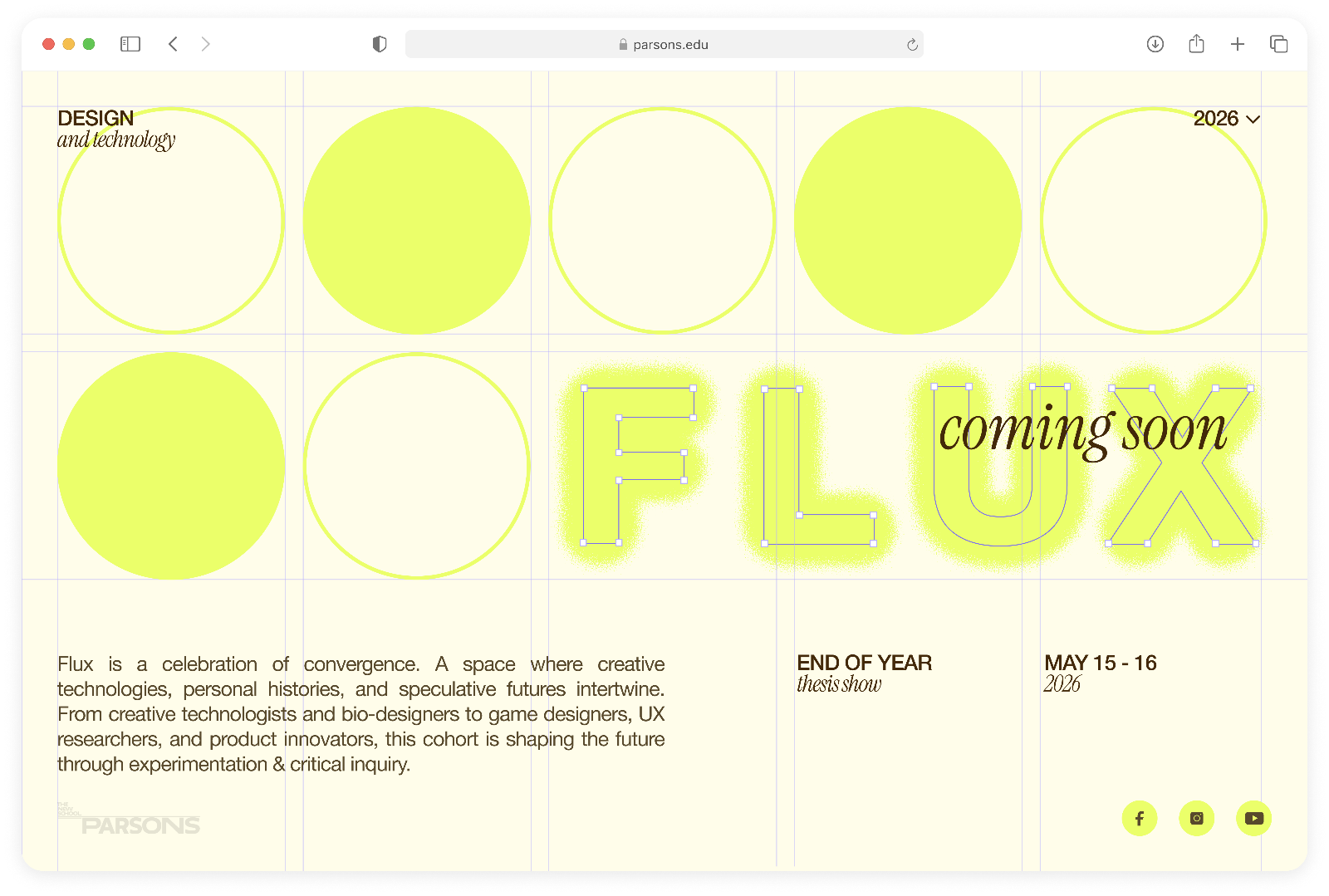
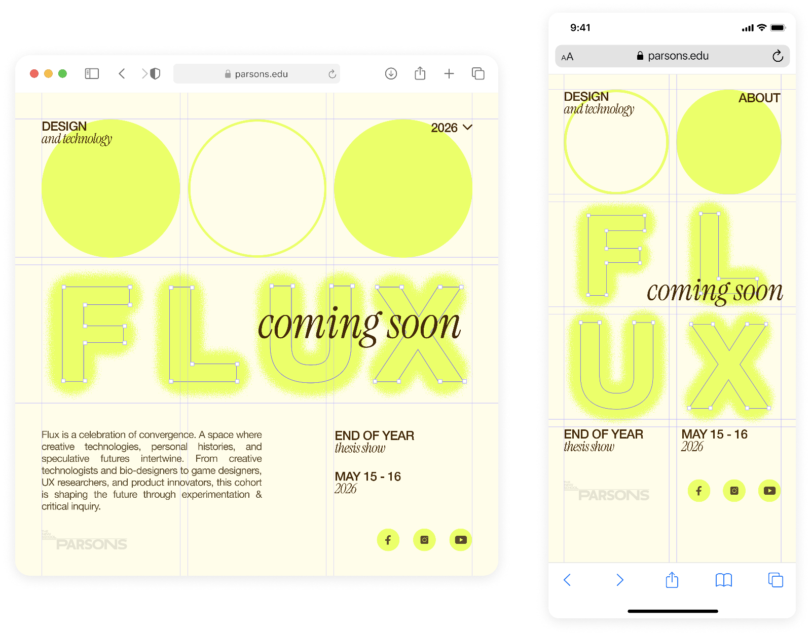
Option three earned the most positive reviews. Many felt the Lemon color overpowered the base, so we swapped some filled circles for open ones. We shipped a responsive "Coming Soon" page to the public link two weeks before the full site launched, shown here across breakpoints.
The critical consideration of user intention.
Looking through previous years' thesis sites, I found a serious information-architecture issue. Beyond an "Events" tab that duplicated the home page, the real problem was the "People" tab: it sent viewers to a person's project the same way the "Project" tab did, instead of telling them about the person.
My point to the team: if a viewer is on the "People" tab, their intent is to learn about the designer themselves, not the project. Linking the project to the designer still matters, but landing on the same page regardless of intent was bad IA and a lack of user consideration, so I insisted we fix it.
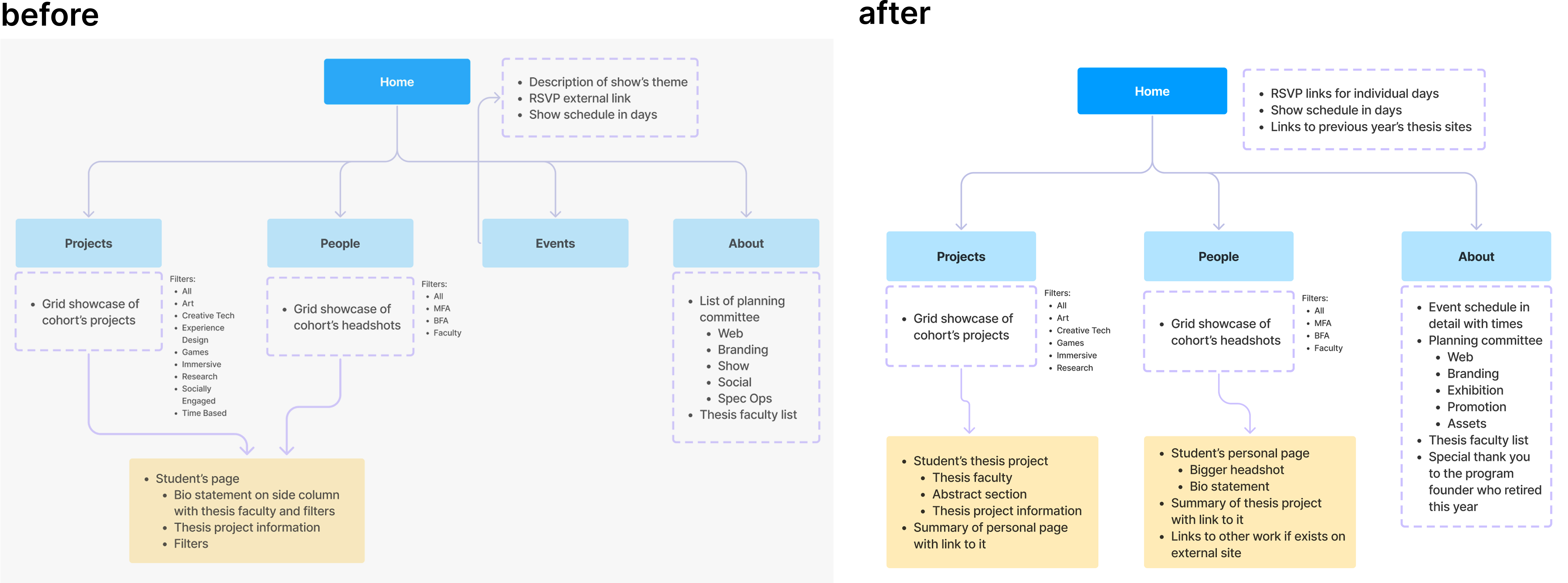
A fully responsive system, scaled across 170+ pages.
Built on Webflow CMS architecture with developer-ready prototypes, Flux launched on schedule for a two-day showcase with 200+ attendees, the program's first thesis site with a deliberately restructured information architecture.
Home page
An interactive hero that reveals a halftone image of the program's floor when a circle is clicked, dots as holes uncovering the layer beneath. On scroll, the two days' RSVPs and links to previous years' thesis sites appear.
People page
A grid of that year's graduating students; open a student to read their bio, a summary of their thesis, and more of their projects.
Project page
A grid of projects; each shows the project's abstract, categories, thesis faculty, and the student's own description.
About page
The show's theme, full schedule, and acknowledgments, including a playful nod to founder Sven Travis, whose face the cursor becomes on hover, marking his retirement this year.
To The Best Team
Leading the design for Flux was one of the most rewarding experiences of my time at Parsons, and that's entirely because of the people I got to build it with.
To my eight-person team: watching everyone bring their ideas to the table, push through rounds of rapid prototyping, and trust each other through the hard decisions made this project something I'm genuinely proud of. The creativity, the openness to feedback, and the commitment to getting it right all the way down to the smallest details made every late night worth it.
What we launched together is a reflection of all of you, and I couldn't have asked for a better team to do it with. Thank you.
A special extra thank you to my co-leads, Rin Kim and Pranav Chaparala — you're the best!