Work
DIANA CHALAKOVA
About
Arc Security
Arc aims to reimagine what safety looks like for a real estate agent and become the industry-wide standard for security. In weekly meetings and through constant collaboration with a team of developers, I led a team of four other design interns in the research of features that would advance the existing product and produce a high-fidelity prototype.
Role
Lead UX Designer, Intern
Timeline
Sept – Dec 2022 (3 months)
Tools
Figma, Illustrator
Problem
How might we make real estate agents feel safer during one-on-one’s with clients?
According to the National Association of Realtors, 33% of agents have experienced a situation that made them fear for their safety. They spend hours with strangers at showings or open houses, often in isolated locations. Yet, there is no industry-wide solution for employee safety management.
“At the end of the day after many long hours of showing homes, I pour myself a glass of wine, sit down on the couch, and think about all the moments where things could have gone wrong.”
- Anonymous Licensed Real Estate Agent from our interviews
Solution
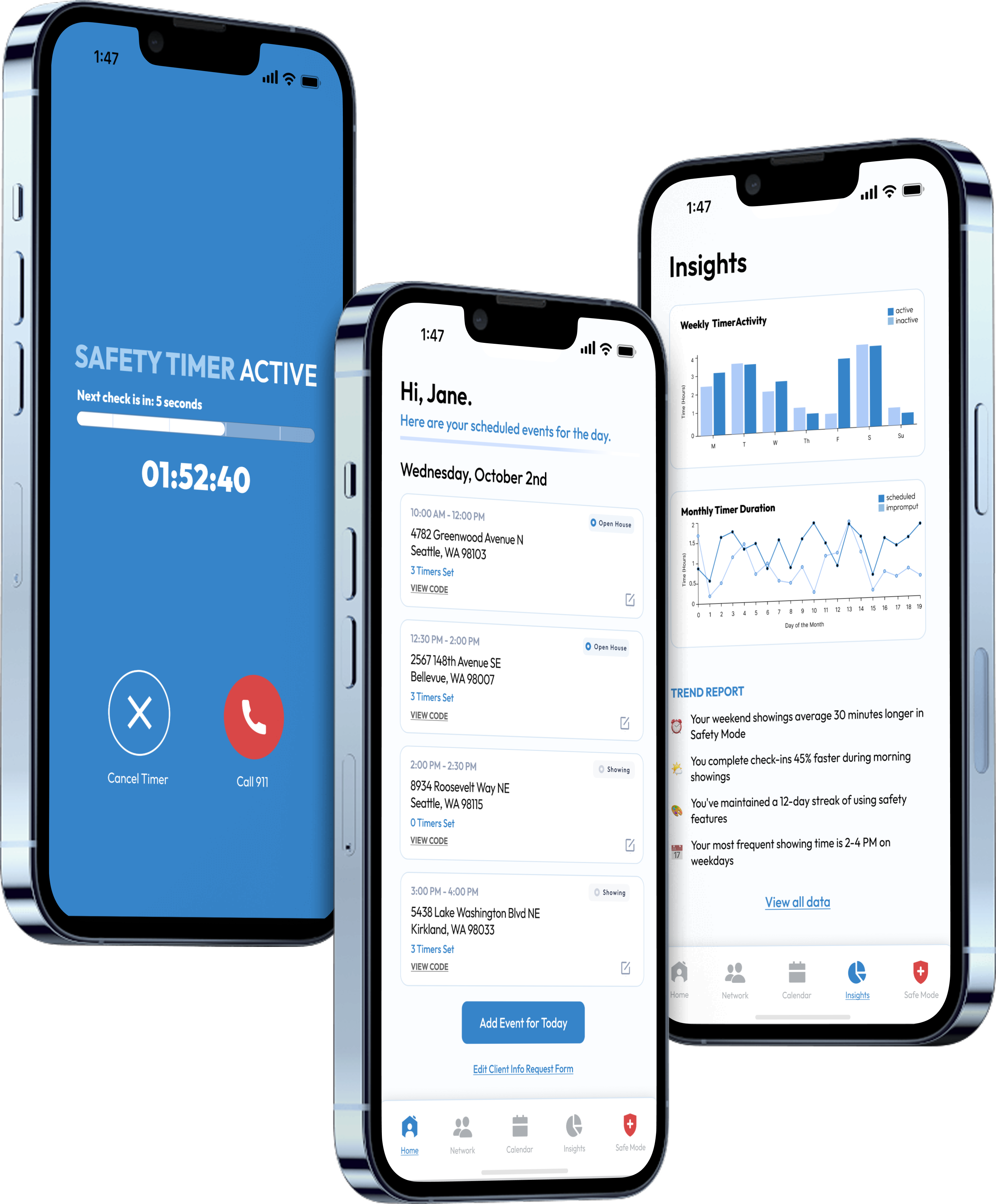
Personalized integration into the user’s pre-existing workflow, prioritizing ease and quick access in high-pressure situations.
Quick access to daily schedule and safety features
- All showings displayed in one view with address, time, timer status, and verification codes
- Expandable CODE button generates identity verification codes without leaving the screen
- Bottom nav bar provides instant access to Safety Network, Calendar, Insights, and Safety Mode toggle
Active protection during showings with multiple safety layers
- Timer runs in background so agents can focus on clients without distraction
- Three taps on the sound button confirms safety, no complex interactions needed
- Missed check-ins trigger automatic texts to safety network with location, client info, and audio recordings (where legally permitted)
- One-tap 911 calling, network alerts, and personal code entry to deactivate alarms
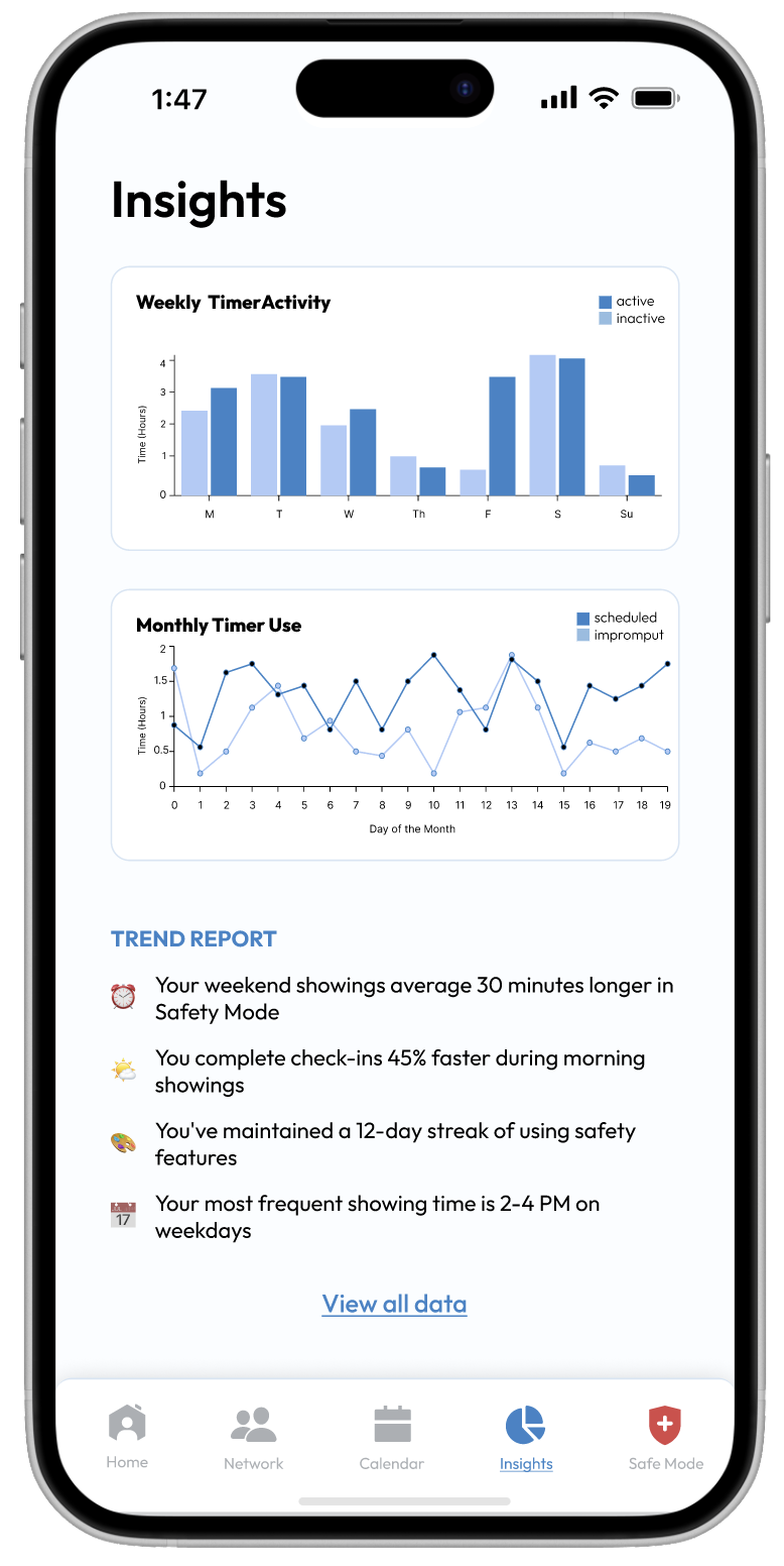
Data-driven feedback to improve safety habits
- Weekly timer activity (timer active vs inactive) and monthly use (scheduled vs impromptu) charts reveal patterns in safety practices
- Personalized insights highlight behaviors (like longer weekend showings or faster morning check-ins) to encourage actionable change
Customizable pre-showing verification for added security
- Allows agents to request specific information like vehicle numbers, ID, social media, empkoyer, and pre-approval from their clients before meeting up
- Implementing agent’s survey answers as add-on options to create an intuitive experience
Research
Safety solutions should offer automation, discretion, and personalized check-ins to support accurate real-world usability.
To understand agents’ needs, I conducted a multi-faceted research approach that included surveys, interviews, and competitive analysis on agent’s current safety practice, concerns, preferences on features, and gaps that our design could provide value in.
From the research, I identified the following takeaways to shape our design approach:
1
Seamless integration
Agents already use informal safety procedures (ex. sharing location), so a new solution must compliment existing habits rather than replace them
2
Automation over manual check-ins
Many agents prefer automated safety features, as they often forget to manually update colleagues or family during a showing
3
Discreet emergency activation
Alerts must be low-profile with silent activation options to avoid drawing attention in high-risk situations
4
Personalized safety settings
Risk tolerance varies, so the system needs customizable check-ins and alerts
Ideation
Integrating user insights to prioritize high-stress usability and an intuitive experience.
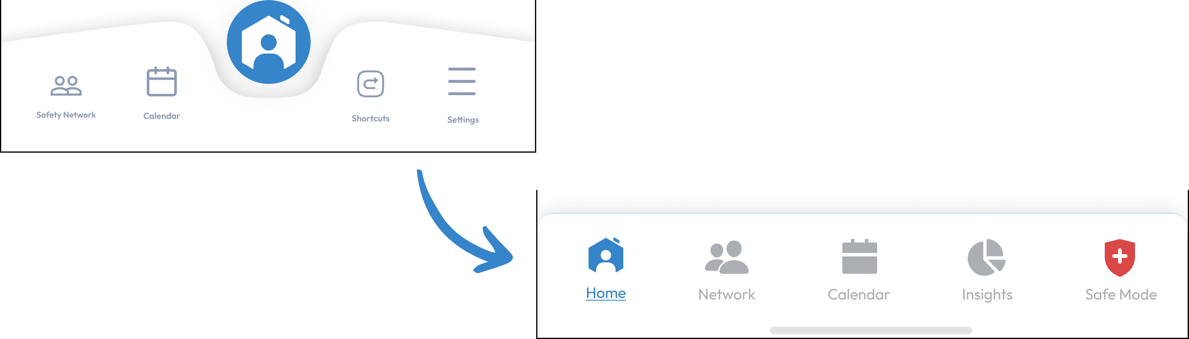
Home Page: Agents needed quick access to critical information without feeling overwhelmed, especially in high-stress situations. We eliminated the safety mode toggle in favor of keeping it persistently accessible in the navigation bar, creating a more intuitive experience with constant availability.
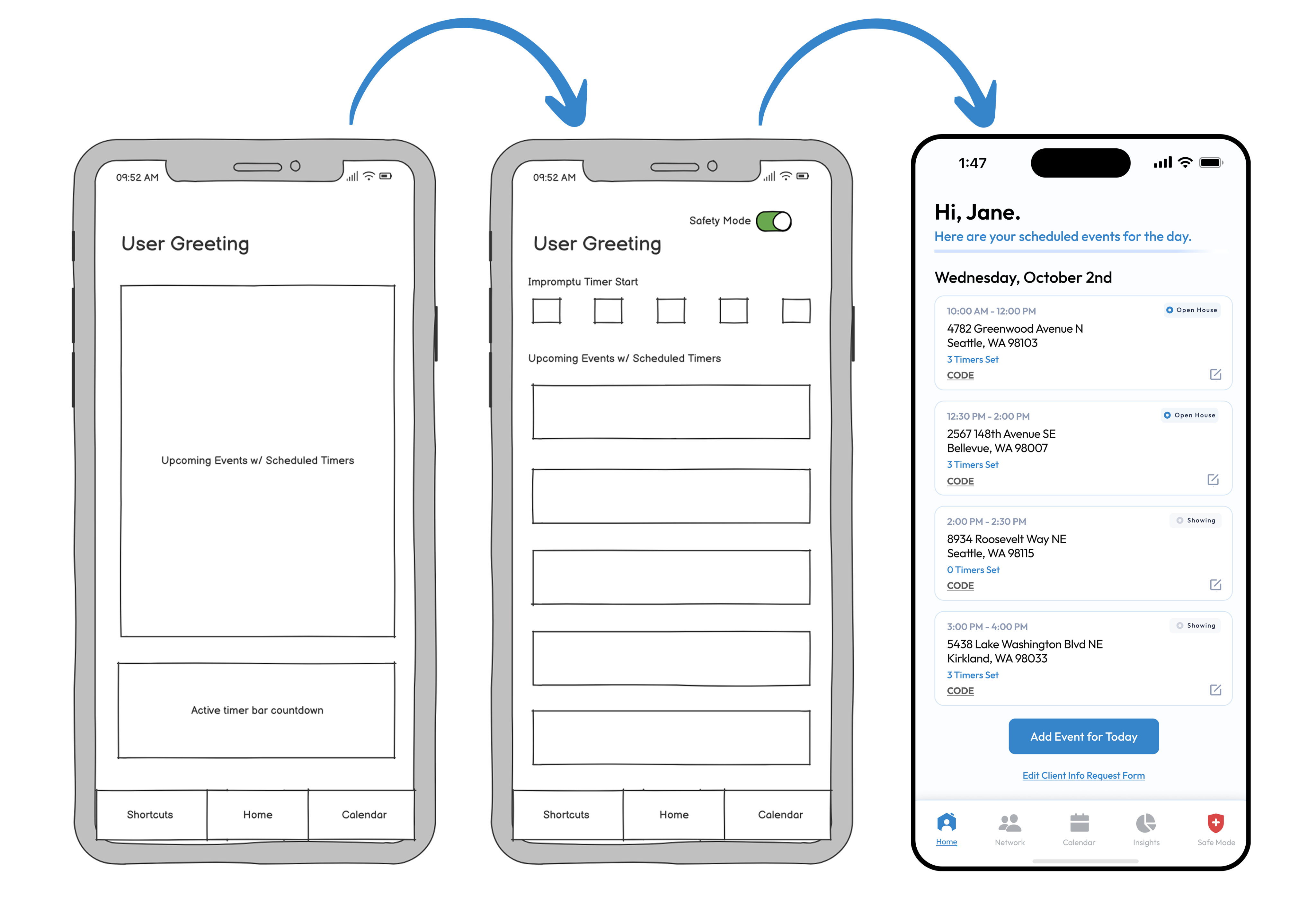
Navigation Bar: The new flat layout reduces cognitive load compared to the previous centered design, making all features equally accessible with clear, recognizable icons.
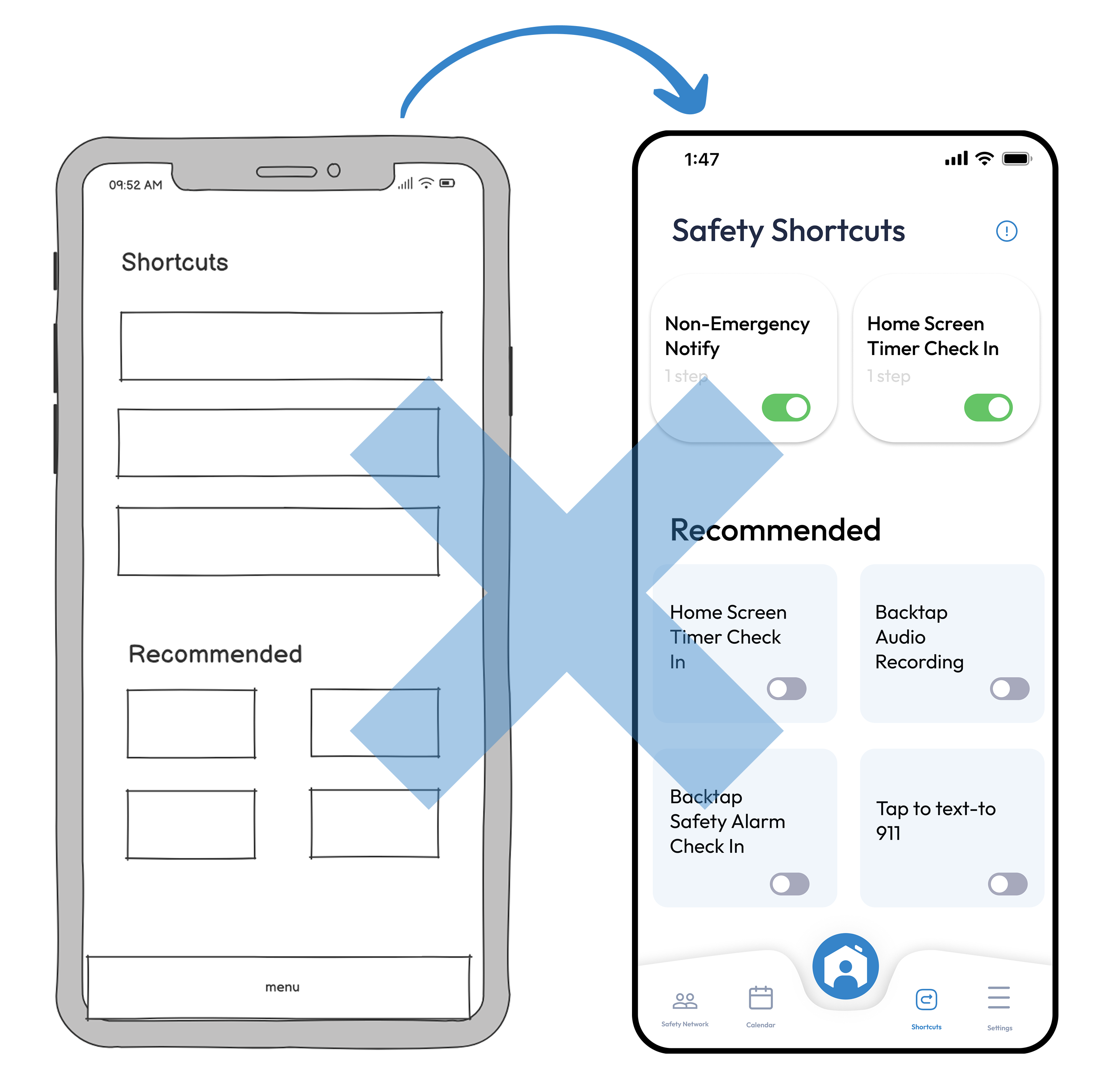
Shortcuts: We explored shortcuts as a way to integrate Arc into users' phones and leverage existing haptics. However, research findings and implementation challenges led us to reevaluate the feature. We determined that the benefits didn't justify the development effort, so we discontinued it.
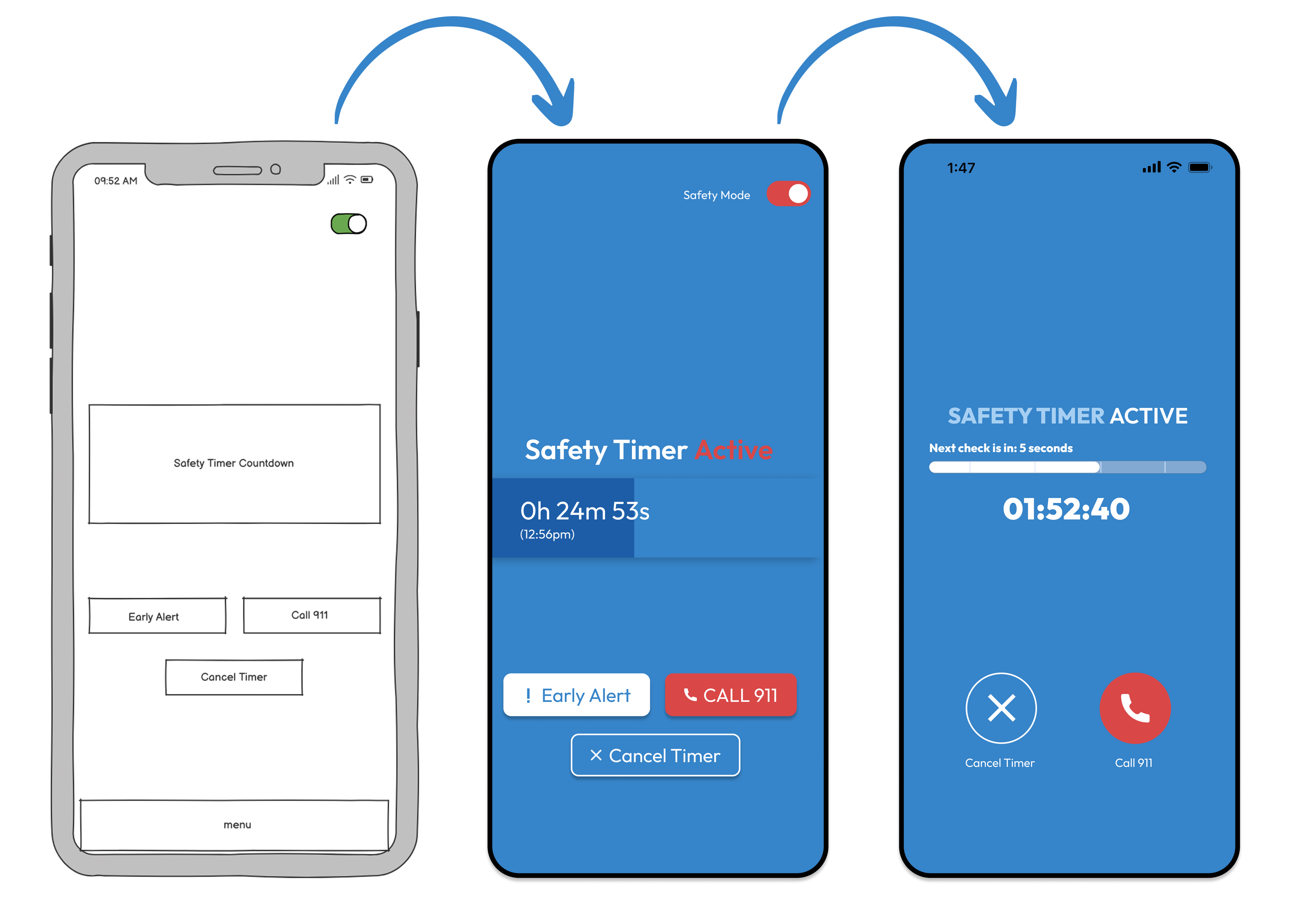
Safety Mode: This feature was my idea, emphasizing in-the-moment safety as the priority. We worked hard to mimic a phone call's layout so that during high-stress situations, users wouldn't have to think twice about which button to press while still seeing critical timer information at a glance. I removed the "Early Alert" button because the system triggers it automatically anyway, and users confirmed that in a true emergency, they'd call 911 rather than text their network.
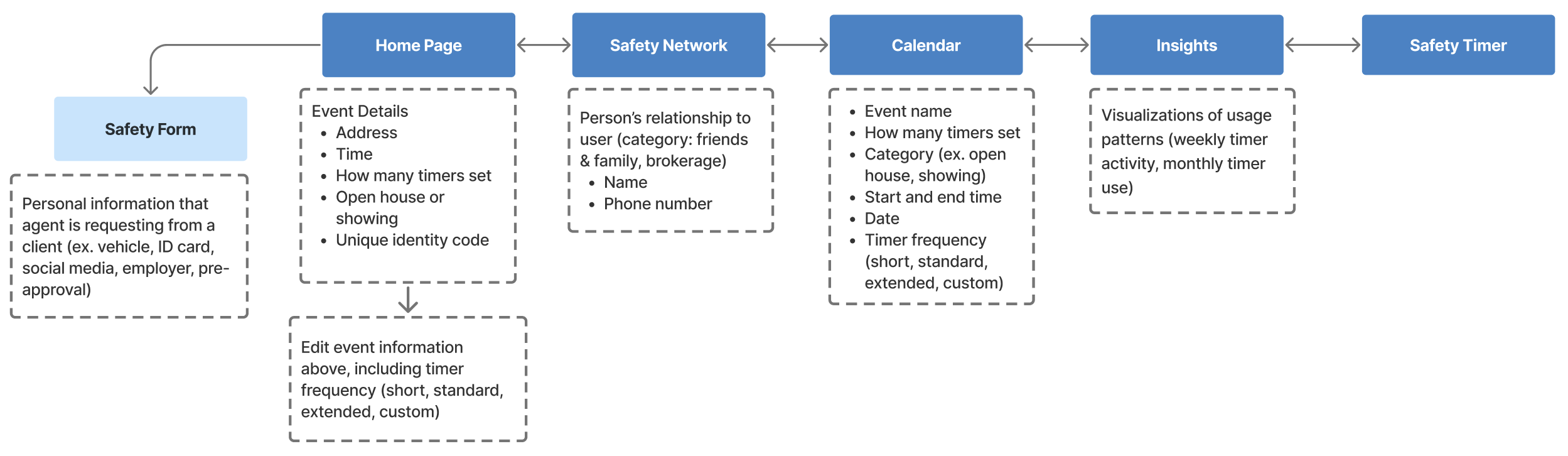
I created the following information architecture for the app’s navigation and features:
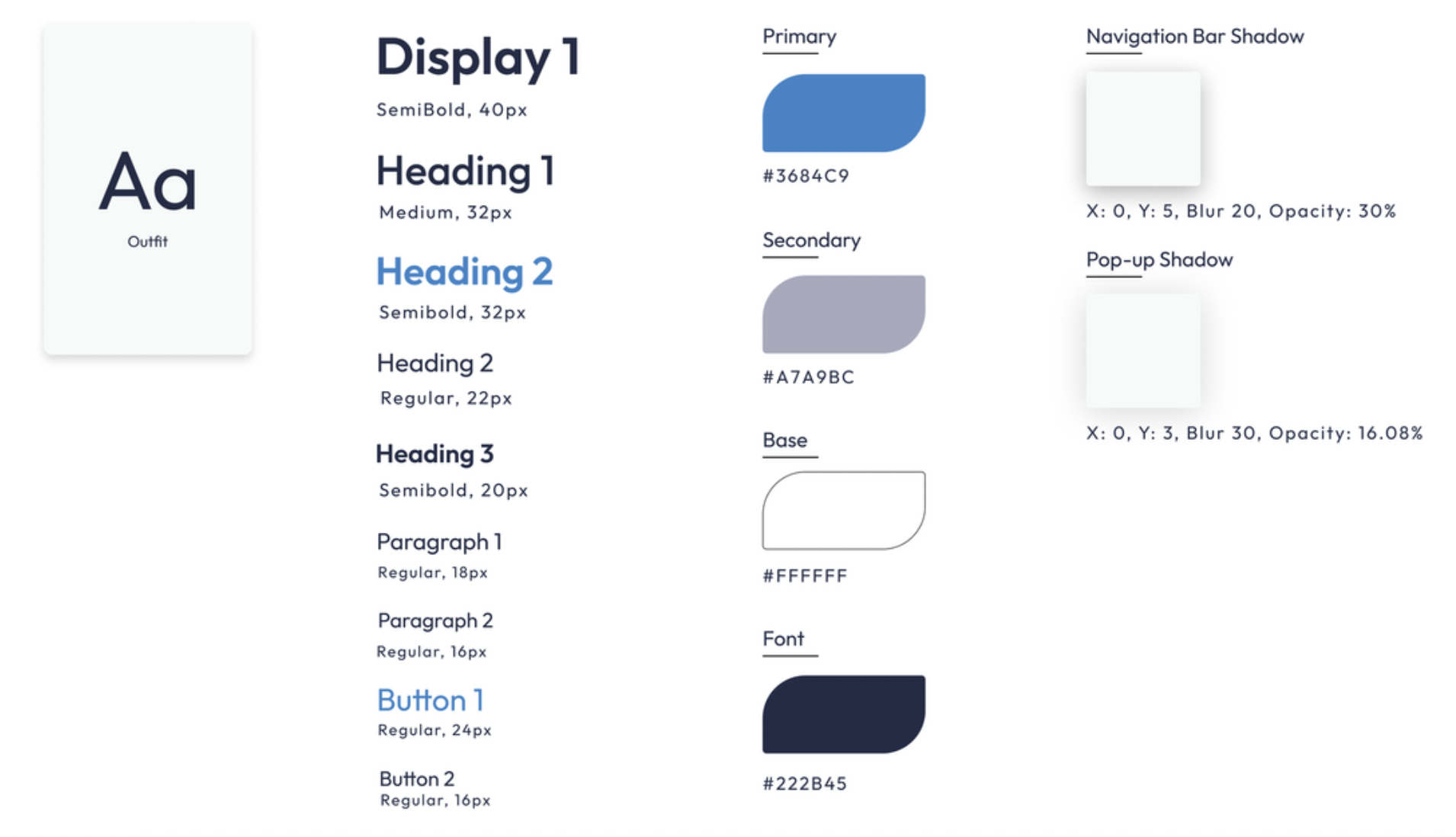
Style Guide
Final Solution (ONBOARDING INCLUDED)
Reflection
Collaboration, leadership, and more lessons from a cross-functional project.
- This was my first internship and full-scale collaborative project! I'm deeply grateful to the Arc team for trusting us to bring their idea to life. Working on a cross-collaborative project with real potential to improve users' lives, both physically and mentally, was incredibly rewarding. I'm excited to apply these lessons to future projects! I learned so much about both design processes and real-world collaboration. My biggest lessons included:
- Leading design sprints: This project built my confidence in structuring workshops, ensuring every team member had a voice while keeping us focused and productive.
- Navigating team dynamics: I learned to balance fairness and kindness, ensuring constructive feedback, even responsibility distribution, and open communication.
- Collaborating with developers: This was my first time working with a development team. I was initially surprised by the natural checks and balances that emerged, but quickly realized this strengthened our product. The lead developer and I made it a priority to reinforce that we weren't separate teams, but one unified team. I've started learning front- and back-end development to communicate more effectively with engineering teams and ensure my designs are both innovative and feasible.
While I'm proud of what we accomplished, I'd approach a few things differently:
- More frequent user testing: Time constraints limited us to testing with few users. While we gained valuable insights, broader testing would have better validated our design decisions. I'd push for earlier, more consistent testing cycles.
- Stronger early alignment: Though our design-development communication improved over time, I'd establish a stronger workflow from the beginning, ensuring feasibility discussions happen alongside design ideation.


Work
DIANA CHALAKOVA
About
Arc Security
Arc aims to reimagine what safety looks like for a real estate agent and become the industry-wide standard for security. In weekly meetings and through constant collaboration with a team of developers, I led a team of four other design interns in the research of features that would advance the existing product and produce a high-fidelity prototype.
Role
Lead UX Designer Intern
Timeline
Sept – Dec 2022
(3 months)
Tools
Figma
Illustrator
Problem
How might we make real estate agents feel safer during one-on-one’s with clients?
According to the National Association of Realtors, 33% of agents have experienced a situation that made them fear for their safety. They spend hours with strangers at showings or open houses, often in isolated locations. Yet, there is no industry-wide solution for employee safety management.
“At the end of the day after many long hours of showing homes, I pour myself a glass of wine, sit down on the couch, and think about all the moments where things could have gone wrong.”
- Anonymous Licensed Real Estate Agent from our interviews
Solution
Personalized integration into the user’s pre-existing workflow, prioritizing ease and quick access in high-pressure situations.
Quick access to daily schedule and safety features
- All showings displayed in one view with address, time, timer status, and verification codes
- Expandable CODE button generates identity verification codes without leaving the screen
- Bottom nav bar provides instant access to Safety Network, Calendar, Insights, and Safety Mode toggle
Active protection during showings with multiple safety layers
- Timer runs in background so agents can focus on clients without distraction
- Three taps on the sound button confirms safety, no complex interactions needed
- Missed check-ins trigger automatic texts to safety network with location, client info, and audio recordings (where legally permitted)
- One-tap 911 calling, network alerts, and personal code entry to deactivate alarms
Data-driven feedback to improve safety habits
- Weekly timer activity (timer active vs inactive) and monthly use (scheduled vs impromptu) charts reveal patterns in safety practices
- Personalized insights highlight behaviors (like longer weekend showings or faster morning check-ins) to encourage actionable change
Customizable pre-showing verification for added security
- Allows agents to request specific information like vehicle numbers, ID, social media, empkoyer, and pre-approval from their clients before meeting up
- Implementing agent’s survey answers as add-on options to create an intuitive experience
Research
Safety solutions should offer automation, discretion, and personalized check-ins to support accurate real-world usability.
To understand agents’ needs, I conducted a multi-faceted research approach that included surveys, interviews, and competitive analysis on agent’s current safety practice, concerns, preferences on features, and gaps that our design could provide value in.
From the research, I identified the following takeaways to shape our design approach:
1
Seamless integration
Agents already use informal safety procedures (ex. sharing location), so a new solution must compliment existing habits rather than replace them
2
Automation over manual check-ins
Many agents prefer automated safety features, as they often forget to manually update colleagues or family during a showing
3
Discreet emergency activation
Alerts must be low-profile with silent activation options to avoid drawing attention in high-risk situations
4
Personalized safety settings
Risk tolerance varies, so the system needs customizable check-ins and alerts
Ideation
Integrating user insights to prioritize high-stress usability and an intuitive experience.
Home Page: Agents needed quick access to critical information without feeling overwhelmed, especially in high-stress situations. We eliminated the safety mode toggle in favor of keeping it persistently accessible in the navigation bar, creating a more intuitive experience with constant availability.
Navigation Bar: The new flat layout reduces cognitive load compared to the previous centered design, making all features equally accessible with clear, recognizable icons.
Shortcuts: We explored shortcuts as a way to integrate Arc into users' phones and leverage existing haptics. However, research findings and implementation challenges led us to reevaluate the feature. We determined that the benefits didn't justify the development effort, so we discontinued it.
Safety Mode: This feature was my idea, emphasizing in-the-moment safety as the priority. We worked hard to mimic a phone call's layout so that during high-stress situations, users wouldn't have to think twice about which button to press while still seeing critical timer information at a glance. I removed the "Early Alert" button because the system triggers it automatically anyway, and users confirmed that in a true emergency, they'd call 911 rather than text their network.
I created the following information architecture for the app’s navigation and features:
Style Guide
Final Solution (ONBOARDING INCLUDED)
Reflection
Collaboration, leadership, and more lessons from a cross-functional project.
- This was my first internship and full-scale collaborative project! I'm deeply grateful to the Arc team for trusting us to bring their idea to life. Working on a cross-collaborative project with real potential to improve users' lives, both physically and mentally, was incredibly rewarding. I'm excited to apply these lessons to future projects! I learned so much about both design processes and real-world collaboration. My biggest lessons included:
- Leading design sprints: This project built my confidence in structuring workshops, ensuring every team member had a voice while keeping us focused and productive.
- Navigating team dynamics: I learned to balance fairness and kindness, ensuring constructive feedback, even responsibility distribution, and open communication.
- Collaborating with developers: This was my first time working with a development team. I was initially surprised by the natural checks and balances that emerged, but quickly realized this strengthened our product. The lead developer and I made it a priority to reinforce that we weren't separate teams, but one unified team. I've started learning front- and back-end development to communicate more effectively with engineering teams and ensure my designs are both innovative and feasible.
While I'm proud of what we accomplished, I'd approach a few things differently:
- More frequent user testing: Time constraints limited us to testing with few users. While we gained valuable insights, broader testing would have better validated our design decisions. I'd push for earlier, more consistent testing cycles.
- Stronger early alignment: Though our design-development communication improved over time, I'd establish a stronger workflow from the beginning, ensuring feasibility discussions happen alongside design ideation.
Work
DIANA CHALAKOVA
About
Arc Security
Arc aims to reimagine what safety looks like for a real estate agent and become the industry-wide standard for security. In weekly meetings and through constant collaboration with a team of developers, I led a team of four other design interns in the research of features that would advance the existing product and produce a high-fidelity prototype.
Role
Lead UX Designer Intern
Timeline
Sept – Dec 2022
(3 months)
Tools
Figma
Illustrator
Problem
How might we make real estate agents feel safer during one-on-one’s with clients?
According to the National Association of Realtors, 33% of agents have experienced a situation that made them fear for their safety. They spend hours with strangers at showings or open houses, often in isolated locations. Yet, there is no industry-wide solution for employee safety management.
“At the end of the day after many long hours of showing homes, I pour myself a glass of wine, sit down on the couch, and think about all the moments where things could have gone wrong.”
- Anonymous Licensed Real Estate Agent from our interviews
Solution
Personalized integration into the user’s pre-existing workflow, prioritizing ease and quick access in high-pressure situations.
Quick access to daily schedule and safety features
- All showings displayed in one view with address, time, timer status, and verification codes
- Expandable CODE button generates identity verification codes without leaving the screen
- Bottom nav bar provides instant access to Safety Network, Calendar, Insights, and Safety Mode toggle
Active protection during showings with multiple safety layers
- Timer runs in background so agents can focus on clients without distraction
- Three taps on the sound button confirms safety, no complex interactions needed
- Missed check-ins trigger automatic texts to safety network with location, client info, and audio recordings (where legally permitted)
- One-tap 911 calling, network alerts, and personal code entry to deactivate alarms
Data-driven feedback to improve safety habits
- Weekly timer activity (timer active vs inactive) and monthly use (scheduled vs impromptu) charts reveal patterns in safety practices
- Personalized insights highlight behaviors (like longer weekend showings or faster morning check-ins) to encourage actionable change
Customizable pre-showing verification for added security
- Request client details before meetings (vehicle info, ID, social media, employer, or pre-approval letters)
- Form fields adapt based on agent preferences from onboarding survey, creating an intuitive experience tailored to individual safety needs
Research
Safety solutions should offer automation, discretion, and personalized check-ins to support accurate real-world usability.
To understand agents’ needs, I conducted a multi-faceted research approach that included surveys, interviews, and competitive analysis on agent’s current safety practice, concerns, preferences on features, and gaps that our design could provide value in.
From the research, I identified the following takeaways to shape our design approach:
1
Seamless integration
Agents already use informal safety procedures (ex. sharing location), so a new solution must compliment existing habits rather than replace them
2
Automation over manual check-ins
Many agents prefer automated safety features, as they often forget to manually update colleagues or family during a showing
3
Discreet emergency activation
Alerts must be low-profile with silent activation options to avoid drawing attention in high-risk situations
4
Personalized safety settings
Risk tolerance varies, so the system needs customizable check-ins and alerts
Ideation
Integrating user insights to prioritize high-stress usability and an intuitive experience.
Home Page: Agents needed quick access to critical information without feeling overwhelmed, especially in high-stress situations. We eliminated the safety mode toggle in favor of keeping it persistently accessible in the navigation bar, creating a more intuitive experience with constant availability.
Navigation Bar: The new flat layout reduces cognitive load compared to the previous centered design, making all features equally accessible with clear, recognizable icons.
Shortcuts: We explored shortcuts as a way to integrate Arc into users' phones and leverage existing haptics. However, research findings and implementation challenges led us to reevaluate the feature. We determined that the benefits didn't justify the development effort, so we discontinued it.
Safety Mode: This feature was my idea, emphasizing in-the-moment safety as the priority. We worked hard to mimic a phone call's layout so that during high-stress situations, users wouldn't have to think twice about which button to press while still seeing critical timer information at a glance. I removed the "Early Alert" button because the system triggers it automatically anyway, and users confirmed that in a true emergency, they'd call 911 rather than text their network.
I created the following information architecture for the app’s navigation and features:
Style Guide
Final Solution (ONBOARDING INCLUDED)
Reflection
Collaboration, leadership, and more lessons from a cross-functional project.
This was my first internship and full-scale collaborative project! I'm deeply grateful to the Arc team for trusting us to bring their idea to life. Working on a cross-collaborative project with real potential to improve users' lives, both physically and mentally, was incredibly rewarding. I'm excited to apply these lessons to future projects! I learned so much about both design processes and real-world collaboration. My biggest lessons included:
- Leading design sprints: This project built my confidence in structuring workshops, ensuring every team member had a voice while keeping us focused and productive.
- Navigating team dynamics: I learned to balance fairness and kindness, ensuring constructive feedback, even responsibility distribution, and open communication.
- Collaborating with developers: This was my first time working with a development team. I was initially surprised by the natural checks and balances that emerged, but quickly realized this strengthened our product. The lead developer and I made it a priority to reinforce that we weren't separate teams, but one unified team. I've started learning front- and back-end development to communicate more effectively with engineering teams and ensure my designs are both innovative and feasible.
While I'm proud of what we accomplished, I'd approach a few things differently, including:
- More frequent user testing: Time constraints limited us to testing with few users. While we gained valuable insights, broader testing would have better validated our design decisions. I'd push for earlier, more consistent testing cycles.
- Stronger early alignment: Though our design-development communication improved over time, I'd establish a stronger workflow from the beginning, ensuring feasibility discussions happen alongside design ideation.