Work
DIANA CHALAKOVA
About
Sensors, Energy, and Automation Laboratory
I was chosen by the engineering laboratory at the University of Washington to redesign their internal dashboard system that their 300+ engineers used so the different external projects an engineer can be working on at once are organized more intuitively and boosts their productivity. This was a solo project that I had full ownership of and consistently reported to the web design team lead after usability testing with every iteration.
Role
UX/UI Designer Intern
Timeline
June - Aug 2025 (3 months)
Tools
Figma
Problem
How might we create an intuitive single-interface system that improves workflow efficiency and increases user satisfaction?
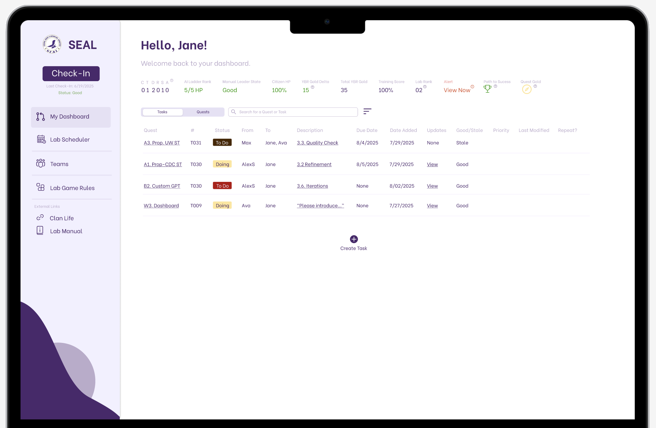
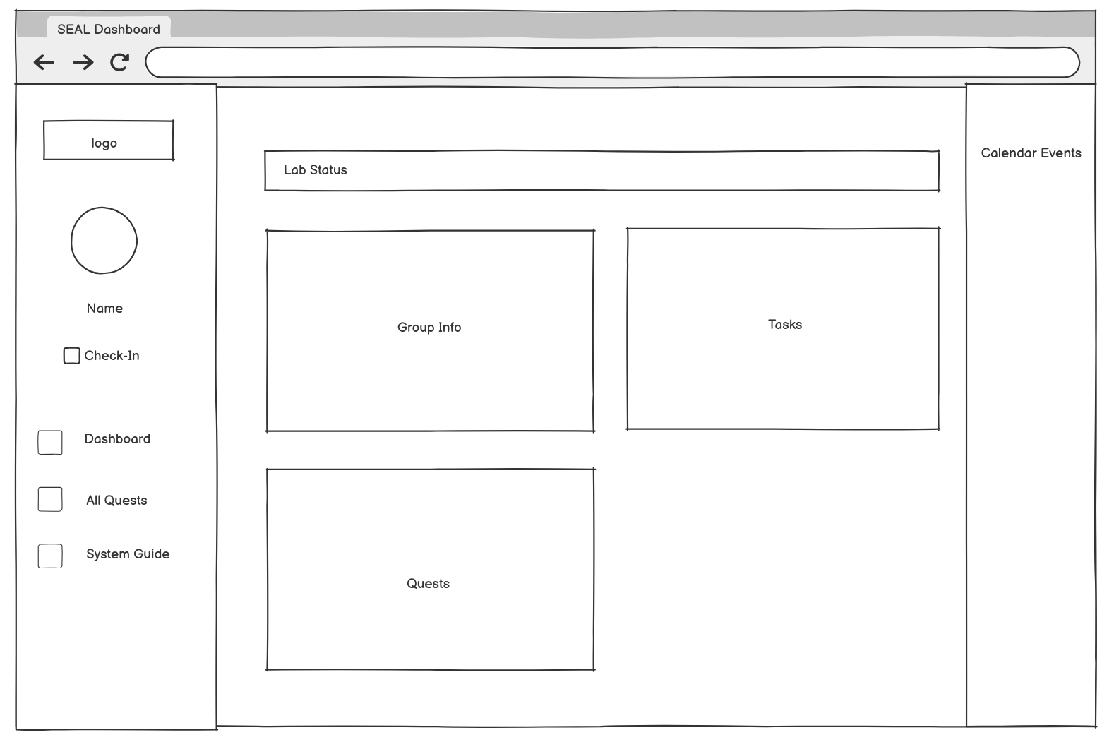
The main dashboard where links to relevant sheets like teams, calendar, and rules are found
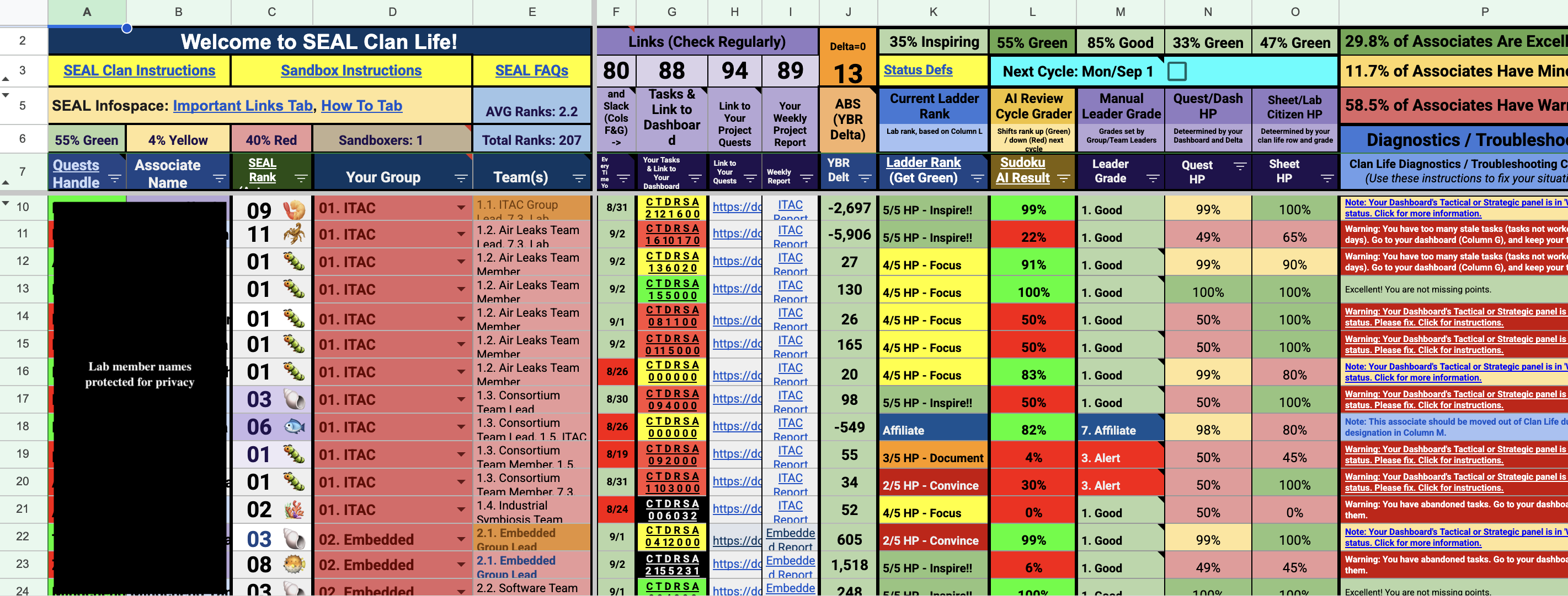
The original individual dashboard hosted on Microsoft Excel
Productivity and project development in the lab was slower than expected and lab members reported difficulties navigating the internal dashboard. as the system consisted of a multi-sheet process that created confusion and slowed down member workflow.
I discovered that new members had a low retention rate due to frustrations with the multi-sheet system that created confusion and slowed down member workflow. Additionally, Experienced members struggled to provide guidance outside of the workflow they were used to when it came to tasks organization, finding new projects, scheduling meetings, seeing team information, and resource management.
Solution
Create new information architecture for core dashboard sections to optimize productivity workflows and address user pain points.
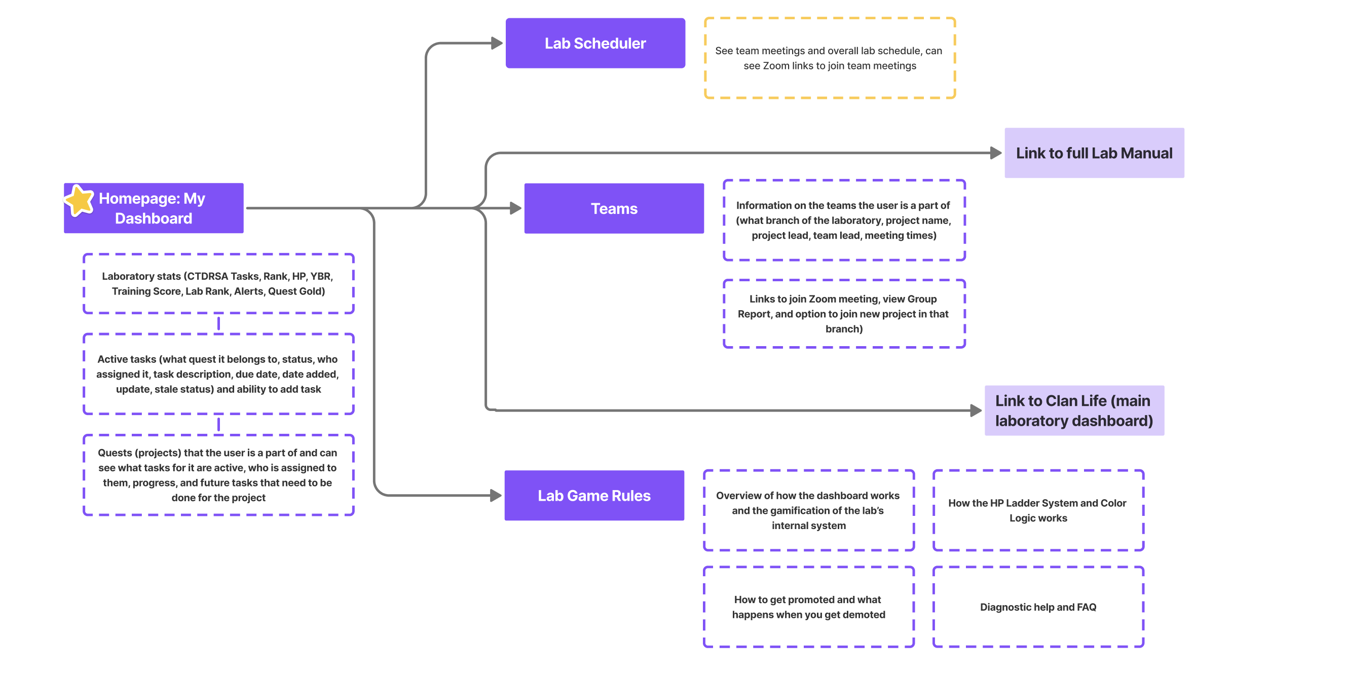
Critical Information Prioritized
The user’s important info is presented in a horizontal line at the top, assigned current tasks and their key information are viewed with ease, and other important pages are in the side nav bar.
Clear Project Timeline
User can switch to their “quests” tab to keep up with project progression as well as view the projects they’re part of, the full steps involved to complete the project, and who’s working on them.
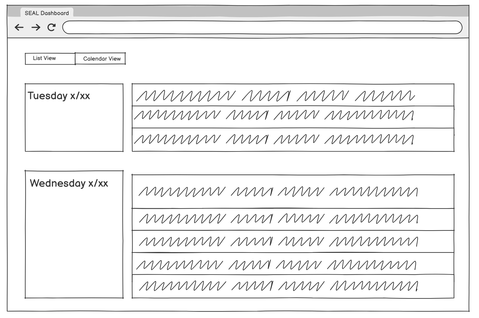
Accessible Calendar
Modeled after Google Calendar, users can easily see when specific teams meet and join their meetings on time.
Easily Accessible Team Information
Users can quickly see their team’s leaders to contact in emergency as well as join new teams and team projects.
“Get Green” Lab Summary
The lab operates on a gamified system for members, so all information on how to stay in the optimal green zone was compiled with a search option.
Research
Critical navigation and workflow inefficiencies hindered user productivity.
I conducted five in-depth interviews and extensive usability testing, which led me to identify 4 significant pain points in the laboratory's existing dashboard system that were severely impacting daily productivity and user satisfaction.
1
Multi-sheet navigation results in productivity loss
Users spent 30+ seconds on simple tasks like locating team information due to unclear naming conventions and fragmented spreadsheet system
2
43% task failure rate for simple workflows
To find project info and understand lab requirements, users had to develop workarounds instead of using the existing interface
3
Low baseline user satisfaction (3/10)
Users described navigation as having "no system", which was particularly problematic for newer lab members
4
Cognitive overload
Having multiple open spreadsheets and constantly switching disrupted natural workflow patterns and decreased efficiency
Ideation
Optimizing information architecture through consistent user feedback.
Iteration 1: I focused on wireframing a comprehensive dashboard that would eliminate the need for users to navigate between multiple spreadsheets. I explored various information hierarchies and layout structures, prioritizing the most frequently accessed functions like lab status information, groups, scheduling, and quests based on the team lead’s desires.
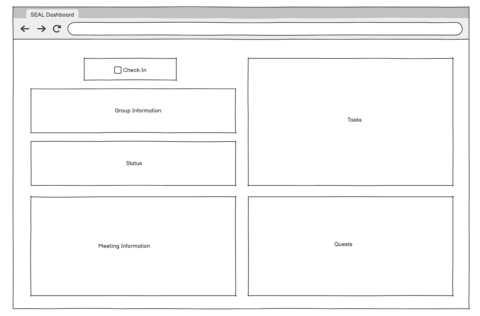
Iteration 2: After user feedback, I deprioritized the feature of a user profile to focus on more critical functionality as it was not to be used in a workflow system. There were certain features that needed to be clearer and more information had to be visible at first glance to accommodate the complexity that can come with a user’s role in the lab, as well as addressing the need for clear communication around performance decisions.
The information architecture that the research and iterations led me to for the final solution is as follows:
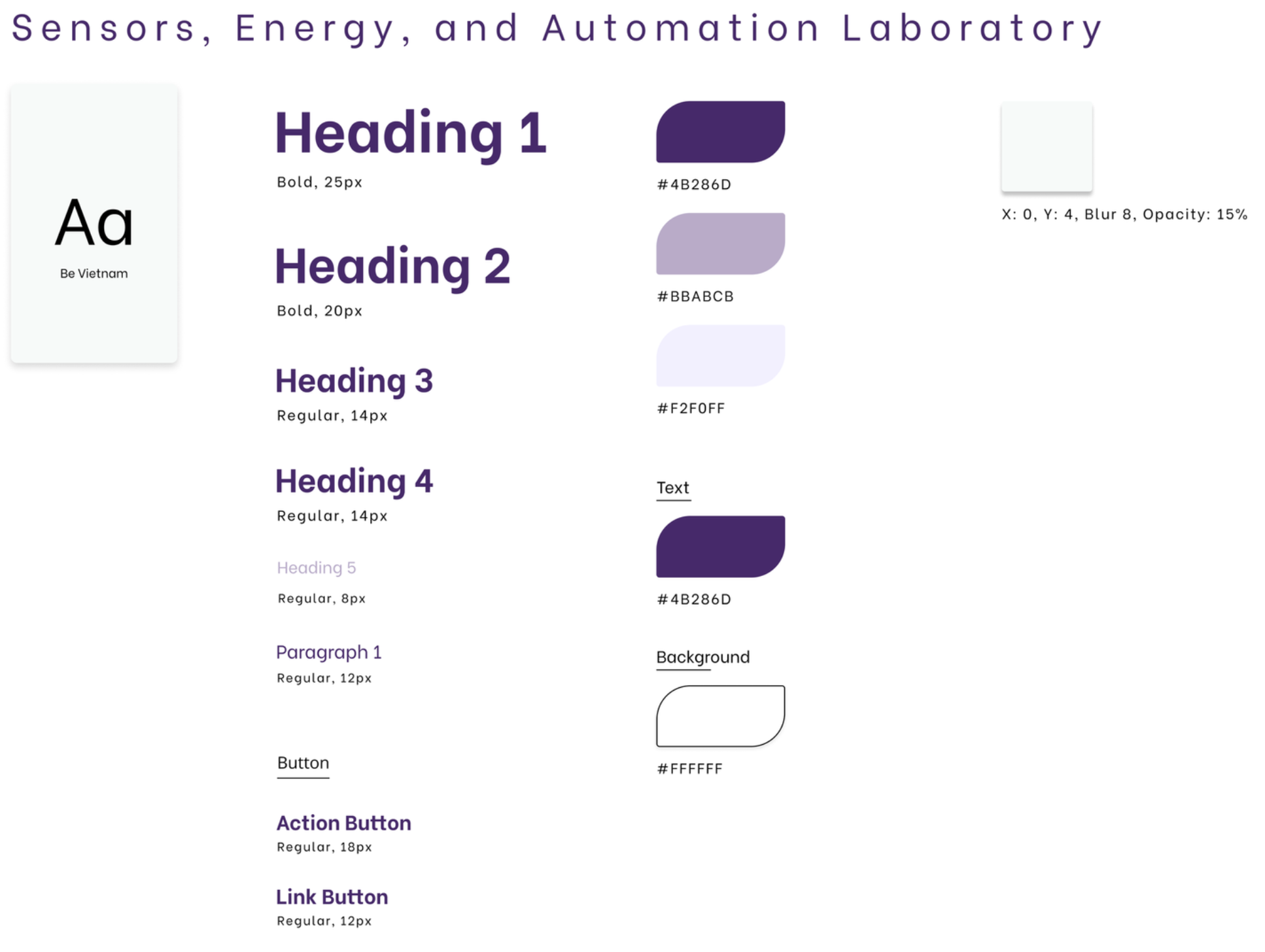
Style Guide
The style guide I created that I referred to throughout the entire design process. As the University of Washington’s color is purple, I wanted to incorporate that into the design.
Final Solution
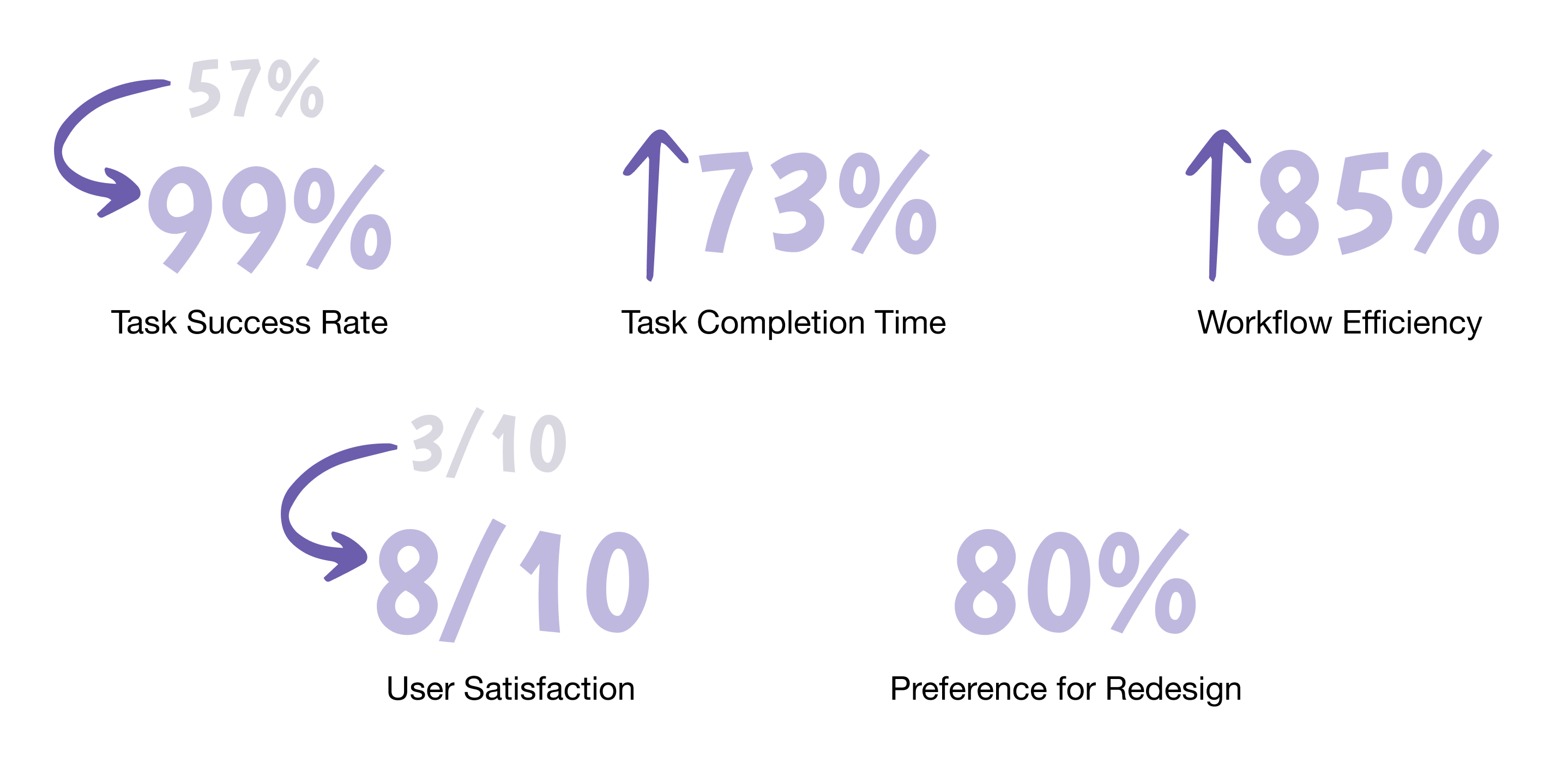
Usability testing with the final solution supported that the issues identified in the original system were addressed successfully.
Confusion periods that had slowed down laboratory operations were eliminated and the consolidated dashboard replaced the fragmented workflows with a streamlined user experience that allows laboratory teams to complete their work more efficiently while maintaining high satisfaction and success rates.
Reflection
The real-life effect of thoughtful design despite real-world constraints.
This internship was an incredibly rewarding experience that challenged me for the first time to apply my skills and knowledge to solve organizational problems. Seeing a prestigious lab be held back by bad digital experience made seeing the positive impact that my design had on the lab extremely rewarding and helped me expand my definition of what good design truly meant.
I went into the project rather ambitious as to how aesthetic I could make it compared to the mess of the original Excel sheet and quickly had to learn how to balance my ambitions with practical implementation realities about how the lab actually operates rather than how I initially assumed it would/should work. In the end, the most satisfying aspect wasn't just seeing the 73% improvement in task completion times or user satisfaction scores rise from 3 to 7.5, but rather it was witnessing previously confusing workflows be navigated with ease during testing, allowing users to focus on their task at hand instead of fighting with the interface.
This project reinforced my passion for UX design while teaching me valuable lessons about stakeholder collaboration, iterative usability testing (huge fan of A/B testing now!), and the importance of designing within real-world constraints. As I head into my final year at Parsons, I'm excited to carry forward these insights about how thoughtful design can genuinely improve people's daily work experiences and organizational efficiency.
A massive thank you to Professor Alex Mamishev for trusting me with this project and giving me this opportunity!
Finally...
Testimonial from the Web Team Lead
“Diana was genuinely a godsend and revolutionized the results of the project. She not only transformed our previous dashboard design into one that is accessible, beautiful, and functional but also conducted thorough testing with lab members on both the current and updated designs and revised her wireframes accordingly with the feedback she received.
Diana breathed life into our new dashboard and was truly a pleasure to work with this summer!”
- Ava Nunes, SEAL Web Team Lead


Work
DIANA CHALAKOVA
About
Sensors, Energy, and Automation Laboratory
I was chosen by the engineering laboratory at the University of Washington to redesign their internal dashboard system that their 300+ engineers used so the different external projects an engineer can be working on at once are organized more intuitively and boosts their productivity. This was a solo project that I had full ownership of and consistently reported to the web design team lead after usability testing with every iteration.
Role
UX/UI Designer Intern
Timeline
June - Aug 2025 (3 months)
Tools
Figma
Problem
How might we create an intuitive single-interface system that improves workflow efficiency and increases user satisfaction?
Productivity and project development in the lab was slower than expected and lab members reported difficulties navigating the internal dashboard. as the system consisted of a multi-sheet process that created confusion and slowed down member workflow.
I discovered that new members had a low retention rate due to frustrations with the multi-sheet system that created confusion and slowed down member workflow. Additionally, Experienced members struggled to provide guidance outside of the workflow they were used to when it came to tasks organization, finding new projects, scheduling meetings, seeing team information, and resource management.
The main dashboard where links to relevant sheets like teams, calendar, and rules are found
The original individual dashboard hosted on Microsoft Excel
Solution
Create new information architecture for core dashboard sections to optimize productivity workflows and address user pain points.
Critical Information Prioritized
The user’s important info is presented in a horizontal line at the top, assigned current tasks and their key information are viewed with ease, and other important pages are in the side nav bar.
Clear Project Timeline
User can switch to their “quests” tab to keep up with project progression as well as view the projects they’re part of, the full steps involved to complete the project, and who’s working on them.
Accessible Calendar
Modeled after Google Calendar, users can easily see when specific teams meet and join their meetings on time.
Easily Accessible Team Information
Users can quickly see their team’s leaders to contact in emergency as well as join new teams and team projects.
“Get Green” Lab Summary
The lab operates on a gamified system for members, so all information on how to stay in the optimal green zone was compiled with a search option.
Research
Critical navigation and workflow inefficiencies hindered user productivity.
I conducted five in-depth interviews and extensive usability testing, which led me to identify 4 significant pain points in the laboratory's existing dashboard system that were severely impacting daily productivity and user satisfaction.
1
Multi-sheet navigation results in productivity loss
Users spent 30+ seconds on simple tasks like locating team information due to unclear naming conventions and fragmented spreadsheet system
2
43% task failure rate for simple workflows
To find project info and understand lab requirements, users had to develop workarounds instead of using the existing interface
3
Low baseline user satisfaction (3/10)
Users described navigation as having "no system", which was particularly problematic for newer lab members
4
Cognitive overload
Having multiple open spreadsheets and constantly switching disrupted natural workflow patterns and decreased efficiency
Ideation
Optimizing information architecture through consistent user feedback.
Iteration 1: I focused on wireframing a comprehensive dashboard that would eliminate the need for users to navigate between multiple spreadsheets. I explored various information hierarchies and layout structures, prioritizing the most frequently accessed functions like lab status information, groups, scheduling, and quests based on the team lead’s desires.
Iteration 2: After user feedback, I deprioritized the feature of a user profile to focus on more critical functionality as it was not to be used in a workflow system. There were certain features that needed to be clearer and more information had to be visible at first glance to accommodate the complexity that can come with a user’s role in the lab, as well as addressing the need for clear communication around performance decisions.
The information architecture that the research and iterations led me to for the final solution is as follows:
Style Guide
The style guide I created that I referred to throughout the entire design process. As the University of Washington’s color is purple, I wanted to incorporate that into the design.
Final Solution
Usability testing with the final solution supported that the issues identified in the original system were addressed successfully.
Confusion periods that had slowed down laboratory operations were eliminated and the consolidated dashboard replaced the fragmented workflows with a streamlined user experience that allows laboratory teams to complete their work more efficiently while maintaining high satisfaction and success rates.
Reflection
The real-life effect of thoughtful design despite real-world constraints.
This internship was an incredibly rewarding experience that challenged me for the first time to apply my skills and knowledge to solve organizational problems. Seeing a prestigious lab be held back by bad digital experience made seeing the positive impact that my design had on the lab extremely rewarding and helped me expand my definition of what good design truly meant.
I went into the project rather ambitious as to how aesthetic I could make it compared to the mess of the original Excel sheet and quickly had to learn how to balance my ambitions with practical implementation realities about how the lab actually operates rather than how I initially assumed it would/should work. In the end, the most satisfying aspect wasn't just seeing the 73% improvement in task completion times or user satisfaction scores rise from 3 to 7.5, but rather it was witnessing previously confusing workflows be navigated with ease during testing, allowing users to focus on their task at hand instead of fighting with the interface.
This project reinforced my passion for UX design while teaching me valuable lessons about stakeholder collaboration, iterative usability testing (huge fan of A/B testing now!), and the importance of designing within real-world constraints. As I head into my final year at Parsons, I'm excited to carry forward these insights about how thoughtful design can genuinely improve people's daily work experiences and organizational efficiency.
A massive thank you to Professor Alex Mamishev for trusting me with this project and giving me this opportunity!
Finally...
Testimonial from the Web Team Lead
“Diana was genuinely a godsend and revolutionized the results of the project. She not only transformed our previous dashboard design into one that is accessible, beautiful, and functional but also conducted thorough testing with lab members on both the current and updated designs and revised her wireframes accordingly with the feedback she received.
Diana breathed life into our new dashboard and was truly a pleasure to work with this summer!”
- Ava Nunes, SEAL Web Team Lead
Work
DIANA CHALAKOVA
About
Sensors, Energy, and Automation Laboratory
I was chosen by the engineering laboratory at the University of Washington to redesign their internal dashboard system that their 300+ engineers used so the different external projects an engineer can be working on at once are organized more intuitively and boosts their productivity. This was a solo project that I had full ownership of and consistently reported to the web design team lead after usability testing with every iteration.
Role
UX/UI Designer Intern
Timeline
June - Aug 2025 (3 months)
Tools
Figma
Problem
How might we create an intuitive single-interface system that improves workflow efficiency and increases user satisfaction?
Productivity and project development in the lab was slower than expected and lab members reported difficulties navigating the internal dashboard.
I discovered that new members had a low retention rate due to frustrations with the multi-sheet system that created confusion and slowed down member workflow. Additionally, Experienced members struggled to provide guidance outside of the workflow they were used to when it came to tasks organization, finding new projects, scheduling meetings, seeing team information, and resource management.
The main dashboard where links to relevant sheets like teams, calendar, and rules are found
The original individual dashboard hosted on Microsoft Excel
Solution
Create new information architecture for core dashboard sections to optimize productivity workflows and address user pain points.
Critical Information Prioritized
The user’s important info is presented in a horizontal line at the top, assigned current tasks and their key information are viewed with ease, and other important pages are in the side nav bar.
Clear Project Timeline
User can switch to their “quests” tab to keep up with project progression as well as view the projects they’re part of, the full steps involved to complete the project, and who’s working on them.
Accessible Calendar
Modeled after Google Calendar, users can easily see when specific teams meet and join their meetings on time.
Easily Accessible Team Information
Users can quickly see their team’s leaders to contact in emergency as well as join new teams and team projects.
“Get Green” Lab Summary
The lab operates on a gamified system for members, so all information on how to stay in the optimal green zone was compiled with a search option.
Research
Critical navigation and workflow inefficiencies hindered user productivity.
I conducted five in-depth interviews and extensive usability testing, which led me to identify 4 significant pain points in the laboratory's existing dashboard system that were severely impacting daily productivity and user satisfaction.
1
Multi-sheet navigation results in productivity loss
Users spent 30+ seconds on simple tasks like locating team information due to unclear naming conventions and fragmented spreadsheet system
2
43% task failure rate for simple workflows
To find project info and understand lab requirements, users had to develop workarounds instead of using the existing interface
3
Low baseline user satisfaction (3/10)
Users described navigation as having "no system", which was particularly problematic for newer lab members
4
Cognitive overload
Having multiple open spreadsheets and constantly switching disrupted natural workflow patterns and decreased efficiency
Ideation
Optimizing information architecture through consistent user feedback.
Iteration 1: I focused on wireframing a comprehensive dashboard that would eliminate the need for users to navigate between multiple spreadsheets. I explored various information hierarchies and layout structures, prioritizing the most frequently accessed functions like lab status information, groups, scheduling, and quests based on the team lead’s desires.
Iteration 2: After user feedback, I deprioritized the feature of a user profile to focus on more critical functionality as it was not to be used in a workflow system. There were certain features that needed to be clearer and more information had to be visible at first glance to accommodate the complexity that can come with a user’s role in the lab, as well as addressing the need for clear communication around performance decisions.
The information architecture that the research and iterations led me to for the final solution is as follows:
Style Guide
The style guide I created that I referred to throughout the entire design process. As the University of Washington’s color is purple, I wanted to incorporate that into the design.
Final Solution
Usability testing with the final solution supported that the issues identified in the original system were addressed successfully.
Confusion periods that had slowed down laboratory operations were eliminated and the consolidated dashboard replaced the fragmented workflows with a streamlined user experience that allows laboratory teams to complete their work more efficiently while maintaining high satisfaction and success rates.
Reflection
The real-life effect of thoughtful design despite real-world constraints.
This internship was an incredibly rewarding experience that challenged me for the first time to apply my skills and knowledge to solve organizational problems. Seeing a prestigious lab be held back by bad digital experience made seeing the positive impact that my design had on the lab extremely rewarding and helped me expand my definition of what good design truly meant.
I went into the project rather ambitious as to how aesthetic I could make it compared to the mess of the original Excel sheet and quickly had to learn how to balance my ambitions with practical implementation realities about how the lab actually operates rather than how I initially assumed it would/should work. In the end, the most satisfying aspect wasn't just seeing the 73% improvement in task completion times or user satisfaction scores rise from 3 to 7.5, but rather it was witnessing previously confusing workflows be navigated with ease during testing, allowing users to focus on their task at hand instead of fighting with the interface.
This project reinforced my passion for UX design while teaching me valuable lessons about stakeholder collaboration, iterative usability testing (huge fan of A/B testing now!), and the importance of designing within real-world constraints. As I head into my final year at Parsons, I'm excited to carry forward these insights about how thoughtful design can genuinely improve people's daily work experiences and organizational efficiency.
A massive thank you to Professor Alex Mamishev for trusting me with this project and giving me this opportunity!
Finally...
Testimonial from the Web Team Lead
“Diana was genuinely a godsend and revolutionized the results of the project. She not only transformed our previous dashboard design into one that is accessible, beautiful, and functional but also conducted thorough testing with lab members on both the current and updated designs and revised her wireframes accordingly with the feedback she received.
Diana breathed life into our new dashboard and was truly a pleasure to work with this summer!”
- Ava Nunes, SEAL Web Team Lead